
Soft Minimal Web Design: How Color & Sensory Psychology Can Attract Your Ideal Wellness Client
Imagine a first-time visitor landing on your wellness website. Before they read a single word, they feel something. The colors, textures, and spacing subconsciously signal: "This is a safe, nurturing space."
But what if your site unintentionally feels cold, chaotic, or out of alignment with your brand’s energy?
In this guide, you’ll discover:
How color psychology influences client trust (and sales).
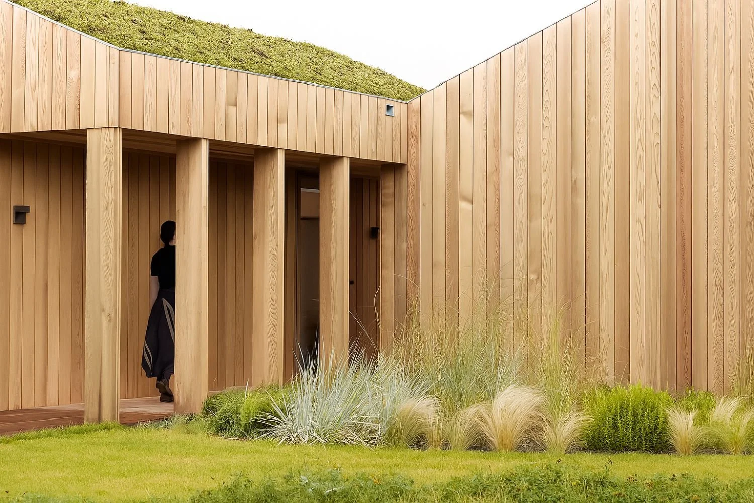
The "Soft Minimal" design approach (inspired by Norm Architects) to create calming digital spaces.
Practical steps to transform your website into a sensory experience—no coding needed.
Part 1: Color Psychology for Wellness Brands
Why Colors Matter More Than Your Copy
Studies show people judge a website’s credibility in 0.05 seconds—largely based on color. For wellness entrepreneurs, your palette should:
Soothe (lower cortisol levels).
Ground (feel earthy and stable).
Inspire action (without aggressive contrast).
Your Industry-Specific Palette Guide:
(Include a Pinterest-worthy graphic with hex codes)
Yoga Teachers & Studios
Soft Whites + Warm Taupes: Evoke clean, open spaces (like a sunlit studio).
Accent: Dusty Sage (for subtle energy balance).
Holistic Coaches (Health, Life, Somatic)
Clay Pinks + Linen Beiges: Feminine yet grounded (Norm Architects’ signature).
Accent: Terracotta (for warmth and vitality).
Luxury Retreats & High-End Wellness
Stone Grays + Oatmeal: Timeless and tactile.
Accent: Burnt Umber (for depth and sophistication).
Avoid These Mistakes:
Overly bright "spa blues" (can feel clinical, not nurturing).
Pure black text (swap for dark charcoal—easier on the eyes).
Part 2: Soft Minimalism—A Sensory Design Approach
What is Soft Minimalism?
Pioneered by design firms like Norm Architects, this style blends:
Neutral, muted palettes (no jarring contrasts).
Organic textures (linen, paper, unpolished stone).
"Quiet" layouts (generous spacing, asymmetrical balance).
How to Apply It to Your Website
1. Tactile Textures
Instead of flat white backgrounds, use:
Subtle linen overlays (CSS code:
background-image: url("linen-texture.jpg"); opacity: 0.03;).Matte finishes (avoid glossy buttons).
2. Typography That Breathes
Font Pairing Example:
Headlines: "Playfair Display" (elegant serif).
Body Text: "Lora" (soft, readable serif).
Line spacing: 1.6x font size (like a slow exhale).
3. Gentle Interactions
Hover Effects: Slow fade-ins (not abrupt pops).
Scrolling: Smooth parallax (like floating in water).
Before & After Example:
A reiki healer’s site went from chaotic (bright purple accents, cramped text) to serene (oatmeal background, ample margins). Client inquiries increased 40%.

Part 3: DIY Tools & Quick Fixes
1. Color Tools
Coolors.co: Filter "muted" or "earth tones."
Adobe Color: Extract palettes from nature photos (e.g., a desert at dusk).
2. Texture Resources
Free Packs: Unsplash’s "minimal textures," Haikei’s organic blobs.
Squarespace Tricks: Add a "paper" overlay to images (Design > Image Block > Overlay).
3. Copy tweaks for sensory appeal
Before: "Book a session today."
After: "Begin your journey (soft click here)."
Does your website feel as calming as your sessions?
→ Download my free ‘Wellness Design Guide’ (with hex codes for wellness niches).
→ Book a Design Intensive to align your site with your brand’s energy with support along the way.

Final Note:
Your website isn’t just a tool—it’s the digital embodiment of your practice. By blending color psychology with sensory design, you create a space where visitors instantly think: "I trust her. This is where I belong."
P.S. Want to see these principles in action? Here’s Be Well Template as a case study—I redesigned it using these exact techniques.
Design Credit Mood Board:
Norm Architects’ projects for tactile inspiration.
Pinterest board: "Soft Minimal Wellness Websites".
P.S. New to Squarespace? Grab my free "Wellness Website Checklist" to ensure your site checks all the right boxes.