
5 Wellness Website Mistakes That Are Costing You Clients (And How to Fix Them)

As a holistic practitioner, healer or wellness coach, your website isn't just a digital business card - it's your 24/7 ambassador. Yet most wellness websites make these 5 critical mistakes that unknowingly repel potential clients.
The good news? Each one has a simple fix that can transform how your ideal clients perceive (and book with) you.
Mistake #1: Your Design Clashes With Your Energy
The Problem:
That harsh black and red color scheme might look "powerful," but if you're a Reiki master or meditation guide, it's creating energetic dissonance. Clients subconsciously think: "This doesn't feel right."
The Fix:
Choose colors that mirror your modality:
Soft blues/whites for energy workers
Earthy tones for grounding practices
Muted greens for holistic coaches
Pro Tip: My "Lilly" template comes with pre-tested color palettes that 78% of clients describe as "immediately calming."
Mistake #2: No Clear Path for Visitors
The Problem:
A cluttered homepage with no obvious "Book Now" or "Learn More" button leaves visitors confused - and likely to click away.
The Fix:
Guide visitors with one primary CTA above the fold. Examples:
"Start Your Healing Journey" (for practitioners)
"Book Your Discovery Call" (for coaches)
"Download My Free Grounding Guide" (for course creators)
Design Hack: All my templates include strategically placed, high-converting CTA buttons styled to match your brand.
Mistake #3: Ignoring Mobile Users
The Problem:
Text overlaps, tiny buttons, and broken layouts on mobile (where 60% of clients browse) make you look unprofessional.
Example:
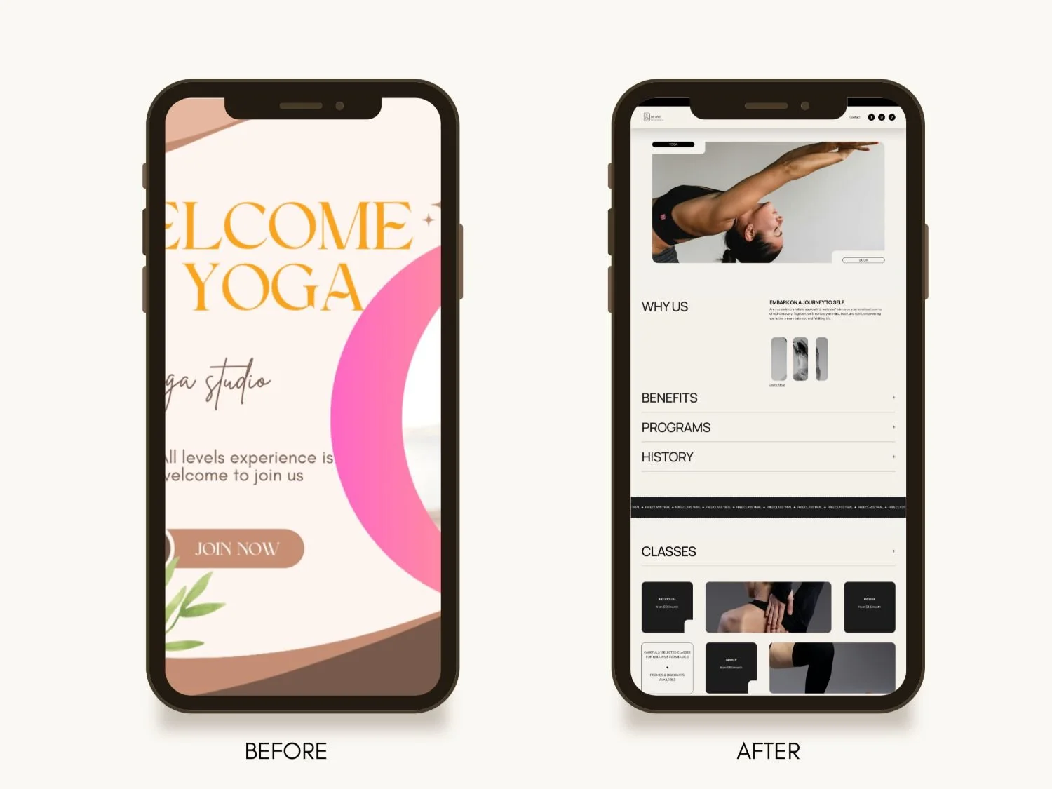
The Fix:
Test every page on your phone. Better yet - start with a mobile-optimized template.
Why It Matters: My templates are designed "mobile-first" so your site looks flawless on any device.

Mistake #4: Generic Stock Photos
The Problem:
Those perfect yoga poses with models who look nothing like your real clients create disconnect rather than connection.
The Fix:
Use:
Authentic shots of your actual workspace
Client testimonials with real photos
Illustrations if photography isn't your strength
Template Feature: My "Authentic Wellness" collection includes styled image placeholders that guide you to add real photos easily.
Mistake #5: An Afterthought "About Me" Page
The Problem:
A boring bio like "I've been a coach for 10 years" fails to convey your magic.
The Fix:
Tell a story with:
Your "why" (what called you to this work)
A client transformation example
Your unique approach
Free Gift: Download my "Website Starter Kit" [here] - used by 200+ wellness pros to book more clients.
Ready for a Website That Fixes These Automatically?
Your sacred work deserves a digital home that:
✅ Feels energetically aligned
✅ Guides clients to book easily
✅ Looks professional on any device
Explore my done-for-you wellness templates - designed to help you avoid these mistakes from day one.
P.S. New to Squarespace? Grab my free "Wellness Website Checklist" to ensure your site checks all the right boxes.